Sunday, 14 December 2014

JEWELLERY: COPPER & BRASS

COPPER

Copper is a basic chemical element and it has a reddish-orange colour due to it being a high thermal and electricity conductivity. This metal is mostly used for electrical wires, pipes and other home based objects, but it is also used to make jewellery and it can also be combined with zinc to make brass.
set_matisse_renoir_greenstone.jpg (350×350)
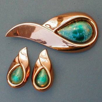
http://www.fashion-era.com/images/Jewellery
/set_matisse_renoir_greenstone.jpg
.
This metal is mostly plated to be used for jewellery decorations after it has been processed. It is plated to give a clean shine and a more presentable, professional and wearable jewellery like this one on the left. In my own opinion this material in particular when I used for my own little samples I didn't like it because it didn't have that shine that brass had naturally without it being annealed. 


BRASS
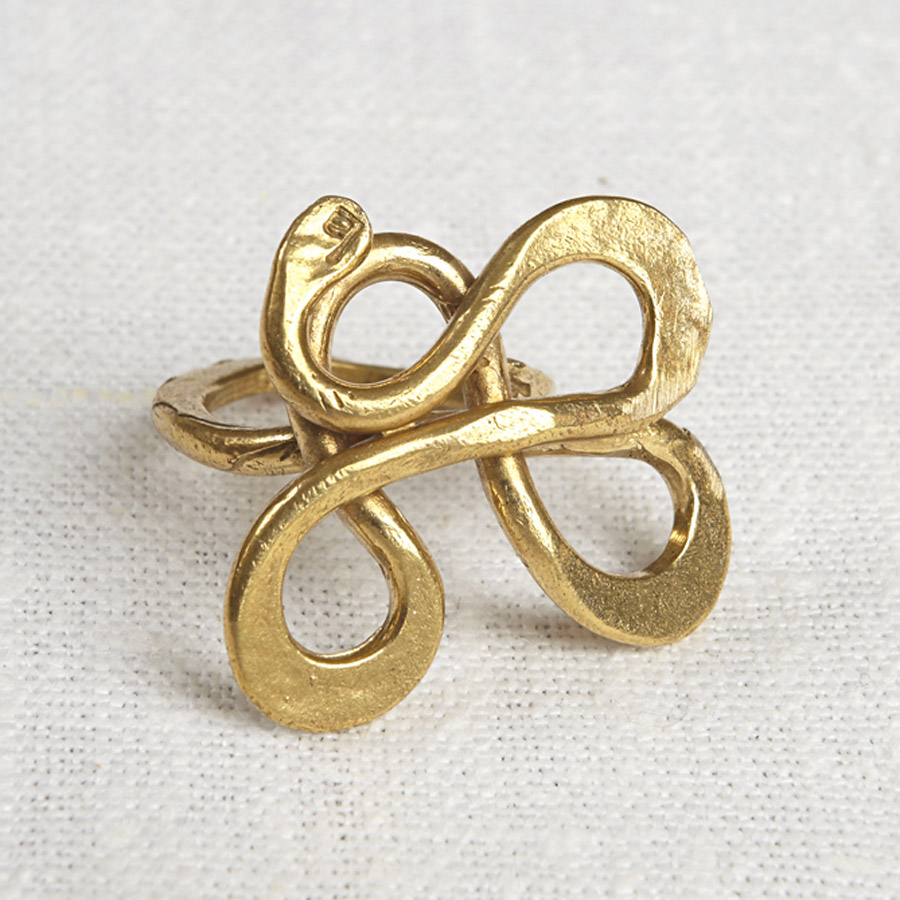
http://images.naturalcollection.com/images/245364-
recycled-brass-serpentine-ring.jpg

As I mentioned previously brass is made out of copper added to zinc, depending on how much zinc is added to the copper, the colour can vary from a dark reddish brown to a light silvery yellow, so thinking about it brass is mostly considered as a copper alloy. However, I do prefer brass over copper due to it having that unique shine and gold colour. 


OVERALL...

I enjoyed using both materials that I used to make little samples, both are great to work with. In future, I would definitely use brass more than copper.


SOURCES: http://www.madehow.com/Volume-6/Brass.html#
http://www.thomasnet.com/articles/custom-manufacturing-fabricating/plating-types
http://en.wikipedia.org/wiki/Plating
http://www.madehow.com/Volume-4/Copper.html


RON MUEK (SCULPTURE ARTIST)


Image result for ron mueck


Ron Muek is a sculpture artist.He studied at Royal Academy of Arts and he he was previously a model maker and puppeteer for childrens' television and films he worked as Ludo on the 1986 film Labyrinth. In my own opinion he's very talented artist who makes a models of human bodies in a realistic scale. His work is so unique to everybody else even though it
can sometimes be weird. I completely admire his work, honestly I've never
known an artist like him. 


This one is of his works that he made, he does use clay to make all these model human bodies.
I am overwhelmed by this piece to be honest, I completely admire it.


This is one in particular is my favourite one, I don't know why but if I had to guess the reason
it would be because I like the way these two models are very simple but unique and small, I also like the way he applied some face expressions to the models' faces. I would guess that is why I mostly admire it. The detail that is applied unto the models are sooo unique that I can't even 
express how I feel about them in my own words. It is simply AMAZING!


Finally, I would like to just point out this sculpture of his in particular, why?! because it is so effective the way everything in it looks so real. At first when I saw this, I just thought that
it was a real person who had cut himself and just posed in a picture
but when I looked at the picture closely, I realised that it was one of his works. 

OVERALL..
I must say there's no work of his that I hate or do not find overwhelming, like I mentioned before, his work is completely unique and amazing, outstanding, admirable. To be honest I do 
not think that anyone on this earth would actually hate his work, that's how great his sculptures are. If I was to choose this area in particular to specialise in, he would be my inspiration and my aim to be like one day.


SOURCES: www.google.com (for pictures)
                    http://www.dailymail.co.uk/news/article-2514500/Are-life-like-sculptures-produced-    Artist-creates-hyper-realistic-models-humans.html

CERAMICS (Group Work)

These two towers that I made along with other people in my group, were the two things that I enjoyed doing the most, the reason is because it was something very different that we had ever done over these few months and it was also fun to do. 


For the first tower me and other couple of people decided to make a princess tower, Repunzel's tower from the Disney Movie called ''TANGLED''. We didn't get a chance to let it go through the process of drying and firing, but it was great to do and I really enjoyed building it up.We used a carton tall tube of about at least 30-40 cm long and we wrapped newspaper around the tube to prevent the clay to stick to the actual tube. To build up the actual tower, we used the coil technique of which was very easy, fast and simple to do as we used a machine to turn the clay into big long sausages, those clay sausages were attached to the tube, wrapped in newspaper, very tight to it to form a tower. After so, we smoothed it out with our fingers and a tool called ''kidney'' that is used to smooth out the clay around without creating lumps etc. The face of Repunzel was made through a Barbie mould and the hair was done through the ''spaghetti'' tool.

 I honestly liked it and to be honest I didn't know that we were capable of doing such a tower. it was fantastic.


The other tower that me and other people did in one group was a person sat down on the chair. To make this clay person we used one of our partner in our team to pose and so we tried our best to make the clay person look exactly like her. This one, is my favourite out of all of the things that I did in ceramics, because it showed to us , and in particular to me, how much we are capable of doing amazing things when you're in a team of people who are hard-working and creative.

DIFFERENT STAGES OF OUR MODEL:


We measured different pieces of wood on her entire body to make sure we got right proportions


We then attached the different pieces together to make the structure of the person.


We then started to apply some clay to it but at some point we kind of realised how
the shoulders weren't at the right place, which is why we started to compare it
to whom we were trying to make the model from. 

When we fixed the problem we wont on and added hair to it, applied more clay
around it, smoothed it out with our fingers, some slip and a kidney.

AND THIS WAS THE FINAL MODEL:


EVALUATION:                                                    
When I compare it to the actual person, what I've realised is that it looks very similar which is why this one was my favourite ceramic project I've done in a day, to be honest me and my group did a great job and I think If we had to do anything else in future as a group it would be something much greater than this. If there's anything that me and my group would improve about it, it would be the proportion; as you can see the legs are a bit too long and look like small sticks, another thing that me and my group would improve would also be the smoothness of the face and the arm, apart from that we are pretty happy about it.


CERAMICS (Samples)

Just a few weeks ago, I went into the ceramics rotations and I made few samples of clay with faces and hands and decorations on it. For the first sample I made got the face from a face mould and shaped it into the face that I wanted it to look like. That massive ''thing'' on it, is  a hand that's doing the peace sign over an eye and on other side I placed a baby's mould face on it and for the rest of the face I made and created different textures to create a patterned face. To be honest I did not plan to do this as it was a sample and I was experimenting. I really like this sample because it is strange, abstract, simple but interesting as I think, that is what I was aiming for. After It dried and it was fired , I believe done in a week, I applied some droplets of glaze on it and made it run through the face.


I made a second sample, which is very different and slightly feminine. The lips on there were done by me as there was no mould to do them from. Also, the spaghetti/hair pieces were done through a tool that allows you to form strands of little fine hairs with soft clay. I really like this one because it is simple but beautiful in my own opinion. The colour is one thing that makes me like it the most, for this one I did also paint sand pink glaze on it with a white glaze that would make it look smooth and shiny. Also, the letters were applied on
with letter moulds that I pushed into the clay.


Saturday, 13 December 2014

Experimenting Autodesk Inventor Professional

Autodesk Inventor Professional is a software that is used to create 3D digital prototypes used in the design, visualization and simulation of products.This software is mostly used by engineers, cutlers and others. Autodesk has three different formats , IPT for parts, IAM for assemblies and IDW / DWG for drawings ,that you can choose depending on what you're using it for. The only two that I can review are IPT and IDW because these are the only two formats I got to use. 

For IPT, I used it to create different parts of a spoon for an initial idea, to create this 3 dimensional design I used different tools in the IPT format but I mainly did sketches in 2D and to make it look 3D I used the extrude tool and typed in the width I wanted it to be. 

I really like this spoon part that I made because it is very different to what everybody else has done. I like the way the sides are curved and shaped and I also like the way it is not all the way curved. If I could improve it in future I would add more designs and patterns to it, If I got the chance to develop it further.


What I can say about this format is that once you know how to use it, it very simple and straight forward and also it allows you to make different designs in few minutes at least 20 minutes , depending on what part you're doing. Personally, I love the way this format allows you to do many things and curve the sides and even erase lines or curves that you're not wanting to see with the Trim tool. I completely love it, it makes it easy to work it with in a short period of time; Another feature that I admire about Autodesk Inventor in particular is the way it has the ''Materials'' tool that allows you to change the colour of your part, finally it also allows you to add text unto the part you've created like I've done below on my camera. Yes, I would use it in future if I was to choose product as an area to specialise at.


I really like the way my camera looks, I love the colours and everything about it. if there was anything that I would improve about it would be the logo.


For IDW, I used the camera that I made in IPT to create an initial design sheet ''below''. One thing that I realised about this format is that you can only use it if you already have an IPT file that you've created because if you don't then you cannot used the IDW, of which I think makes sense but at the same some people may want to create an initial drawing sheet on the computer, of which I think that's when Adobe Illustrator comes however that software can only display 2D designs unlike Autodesk Inventor.                                                                   
To open my IPT file I went on to new and selected my file and then a window came on where I could choose the scale I wanted it to be and so I typed in 3:1 , because I wanted to be able to display at least three sides of my drawing. What I love about IDW is that it allows you to display the details of the drawing eg. Company name, your name and other. 

OVERALL:
I do love this software because it allows you to create 3dimensional objects in a very short amount of time unlike Adobe Illustrator, I really enjoyed exploring it. In future I may use it for my future project.


Imperial War Museum

So a few weeks ago, I visited the Imperial War Museum, the one that's situated
in Manchester, and the first thing that I noticed once I got off the coach
is the enormous, beautiful building that was in front of me. So because I really liked it,
I went on to research more about it.


When I researched about this building I found that the building was built in 1997 and was finished in 2002, so that's when they opened the museum for the public to visit. The design was called Studio Libeskind Architects and the architect who designed is called Daniel Libeskind, of which I will do a research of him later on. The architectural style of this building is ''Deconstructivisim''; this style is a development of postmodern architecture that began in the late 1980s. It is influenced by the theory of "Deconstruction", which is a way of manipulating a structures's surface and making it look unusual. 

My Thoughts

Personally, I think that Daniel Libeskind did a great job with the building because personally I think that it goes with the concept of it being a war museum and so it matches with its purpose. Also, I love the way the museum on the inside has two floors, of which the one on the upper floor gives you a great overview of the outside of the building.
Another thing that I admire is the way the building is situated next to the ship canal; this gives me a thought of why the building was placed there, maybe because Daniel wanted it to look like a war ship on the sea, of which I think it is fantastic. 

In matters of research of war events and clothes etc, I think that this museum is the one that actually provides every little detail of what it is exhibiting, the reason why I am saying this is because every thing that I saw in the building had information and also games that could be played in groups to give that experience of the past wars. So in my own opinion it provides a very good amount of information compared to the other museums and galleries that I've visited like Yorkshire Sculpture Park. Finally, there is nothing that I would improve as an overall,the design, the information, the pictures, the videos that are shown in the museum are all on point!

Sources: http://en.wikipedia.org/wiki/Imperial_War_Museum_North
               http://en.wikipedia.org/wiki/Deconstructivism
               http://www.e-architect.co.uk/manchester/imperial-war-museum
               http://www.google.com/images (for pictures of building)


Sunday, 30 November 2014

Jenny Saville


This is my most favourite life drawing portrait I've seen. The colour that has been used to create that particular image and expression, I completely admire it! Also the way the colour has been applied with different lines to make it stand out makes it fantastically admirable. That bright blood red colour that slips down from her lips to her neck makes the portrait more understandable. The emotion in her eyes in fantastic. Jenny Saville did a great job!

Thursday, 16 October 2014

Pole Moon

This picture was taken while on a walk searching for old, texture and attractive things to take a picture of. In my perspective this wet small pole represents the moon in the night. It is simply beautiful to me.

Thursday, 2 October 2014

Fashion Illustration

I found this Illustration while browsing on Peggy Wolf's Etsy shop to find out more about her illustrations and which materials she used. So I thought I'd select this one in particular because it attracted my attention and to me it shouted out a range of different words that I could use to describe the illustration; elegance, pride in beauty of a woman and red, simply because the colour palette in this illustration are mainly set in that colour.