Thursday, 12 February 2015

Lightpainting Lab

Lightpainting Lab is a photography company owned and founded by Alexander Kesselaar.
This photography company does light painting with different light sources, LED, fire, the Sun or the Moon. Please check out this website to see more of his work  
.http://lightpaintlab.com/
Northline Commercial  Photograph
.
These Lightpainting Images were created as part of the Northline Commercial rebranding and are a feature in all of the companies communications and advertisements

Tuesday, 10 February 2015

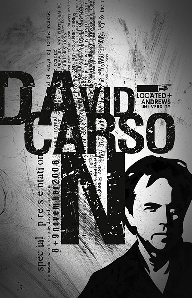
David Carson

David Carson is an American graphic designer, art director and surfer. He is well known for his innovative magazine typography. The message that he's trying to send through his work is the fact that young people could still read but read in a fun way, which is why his work has different letters that have different sizes and positions, as he wants young people to read again.

Before 1993, David Carson's work was illegible but in 1993 he started his own font label for the Ray Gun Magazine, called GarageFonts, and since then his work has become legible but still kind of hard to read due to it being in different positions and even sometimes one behind the other.

His inspiration is mainly his environment, he taken pictures of what he sees because he believes that what he sees is a great inspiration and causes him to design the things he has designed.


Personally, I think that David Carsons work is really good and that he has a very creative way of projecting it in his magazines.


Sunday, 8 February 2015

EVALUATION

Even though I wasn't able to create my final product, I could finally come to a conclusion of what I wanted to make and how I wanted to make it. However, I was able to make the lower part of the boots which is the slipsole,outsole and toe box all put together to make the lower section of the boot. 

 For this I used wood, Acrylic paint,,PVA glue, sequins, and 0.5cm (long) nails. The materials that I used to create this made the actual piece successful and also suitable for the lower section of a boot. I wanted to create something that gave a certain sense of light which is why I added some sequins to it so that when it is worn the sequins move and create light.


Personally, I think I could have done so much better is a sense, be more creative. What I mean by that is that, could have used different colors for this to make it less common and also I should have made it rest and dry for a day so that It would have looked neat instead of having all those green towel tissues marks on it. 
The materials that I used did make it work, but at the same time I'm thinking that if it was added to a boot and worn for about at least 4 weeks the paint would have worn off and you would be able to see the wood. So, I would say if I had to do this again, I wouldn't use wood or maybe acrylic paint but something that would make the product have a long lasting life cycle.

Overall, I proud and happy of what I have achieved in this 3D area with the theme of light but personally I think I've found it very hard to apply it to what I wanted to create.
Next time, I would have to work quickly and be more decisive and also know what I am doing.

Wednesday, 28 January 2015

Ying Gao


Ying Gao

is a fashion designer and also a proffessor. She gets inspiration of her clothing from
the transformations and social events that are going on around the world.
Most of her designs are inspired by architecture, urban design and multimedia; she combines
them to come up with a unique design.
 http://yinggao.ca/eng/interactifs/nowhere-nowhere/
Check sketchbook 'Ying Gao' page


One of her interactive projects had lights in her designs; of which are the ones that were inspired
by an essay called "Esthétique de la disparition" (The aesthetic of disappearance), by Paul Virilio (1979). "
It is made of photoluminescent thread and imbedded eye tracking technology, is activated by spectators' gaze. A photograph is said to be “spoiled” by blinking eyes – here however, the concept of presence and of disappearance are questioned, as the experience of chiaroscuro (clarity/obscurity) is achieved through an unfixed gaze.

Wednesday, 7 January 2015

PanGenerator (NECLUMI DIGITAL)


DIGITAL LIGHT JEWELLERY 


I found this, the other day, and I thought how creative and amazing it is. In simple words Pangenerator is an app that creats Neclumi jewellery with a projected light; in fact I find it so intriguing on how technology is coming into the art world more than before. This app can be found on the Apple Store, you want to know how it works? Then check out this website and you'll have all the information you need about
it.                                                           


Monday, 5 January 2015

2015 "INTERNATIONAL YEAR OF LIGHT"

 
2015 has been set as a year of light all over the world and I think it is a great choice. Reflecting on light, trully it is everywhere; as years have gone by the knowledge in light of the world, as an overall, has improved and it has become a source that's used everywhere all the time that it has even become an unnoticable source.Infact, the world is starting to include light in opening ceremonies , in buildings and in art. Here are some pictures of light in the world:


Cricket World Cup
                                                                

Olympics 2010


Natural sunlight in a cave.


Natural sunset


Light in nature is my most favourite because it is so intriguing and attractive to see how nature can create light in such a colourful way; I love it. It is very unique and it creates a certain overview without anything being touched, to me is see light in nature as a freelance artist that finds inspiration itself.


One thing I'd like to mention is that there will be events around the world that involve this particular theme, as it is an international year of Light. This was launched in Spain a few days ago and this is what the opening ceremony looked like (see below).

There is an event , as far as I am concerned, in the Bath, UK, called "Illuminate 2015" and in this event they lit up a telephone boot and it looked so magnificent and amazing, it started on the 3rd of January and it will end on the 10th of January.


phonebox1
BATH ''ILLUMINATE 2015" UK.


Sunday, 14 December 2014

JEWELLERY: COPPER & BRASS

COPPER

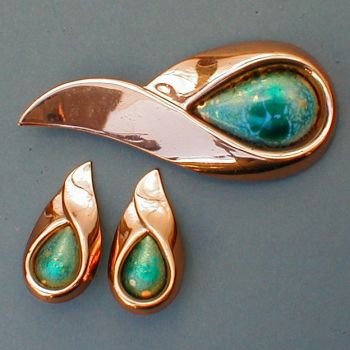
Copper is a basic chemical element and it has a reddish-orange colour due to it being a high thermal and electricity conductivity. This metal is mostly used for electrical wires, pipes and other home based objects, but it is also used to make jewellery and it can also be combined with zinc to make brass.
set_matisse_renoir_greenstone.jpg (350×350)
http://www.fashion-era.com/images/Jewellery
/set_matisse_renoir_greenstone.jpg
.
This metal is mostly plated to be used for jewellery decorations after it has been processed. It is plated to give a clean shine and a more presentable, professional and wearable jewellery like this one on the left. In my own opinion this material in particular when I used for my own little samples I didn't like it because it didn't have that shine that brass had naturally without it being annealed. 


BRASS
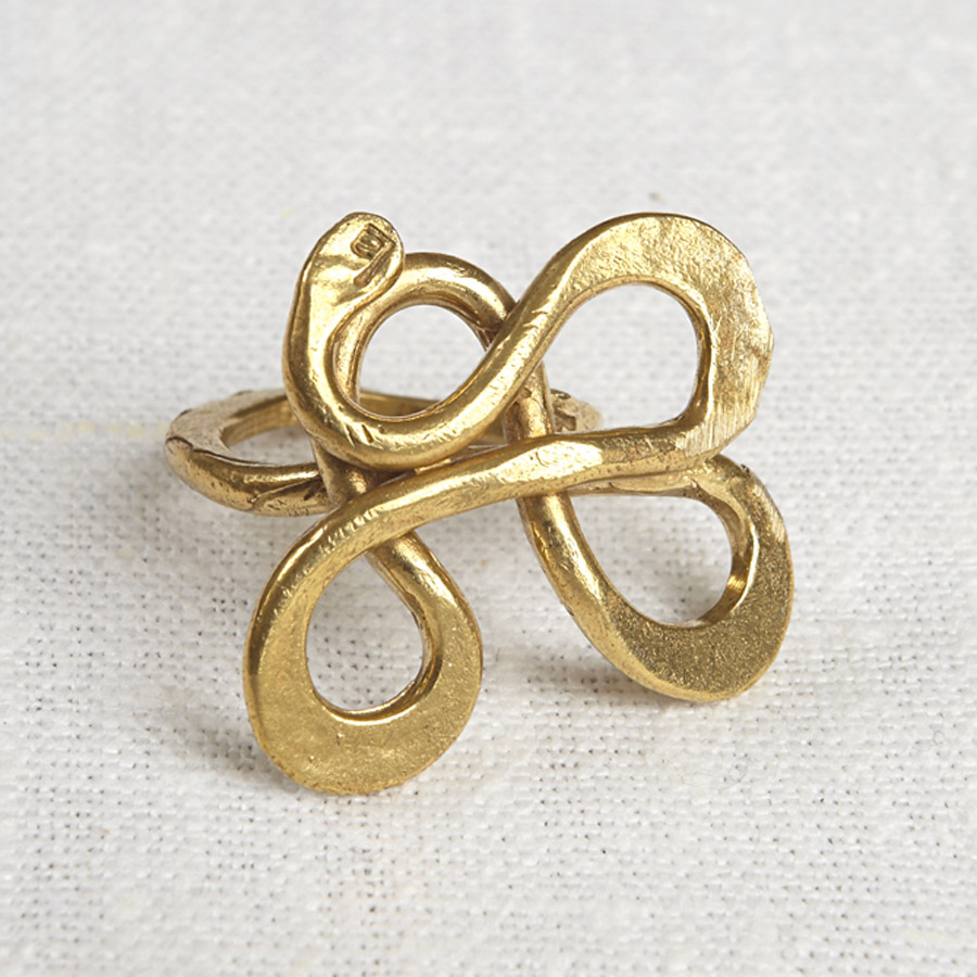
http://images.naturalcollection.com/images/245364-
recycled-brass-serpentine-ring.jpg

As I mentioned previously brass is made out of copper added to zinc, depending on how much zinc is added to the copper, the colour can vary from a dark reddish brown to a light silvery yellow, so thinking about it brass is mostly considered as a copper alloy. However, I do prefer brass over copper due to it having that unique shine and gold colour. 


OVERALL...

I enjoyed using both materials that I used to make little samples, both are great to work with. In future, I would definitely use brass more than copper.


SOURCES: http://www.madehow.com/Volume-6/Brass.html#
http://www.thomasnet.com/articles/custom-manufacturing-fabricating/plating-types
http://en.wikipedia.org/wiki/Plating
http://www.madehow.com/Volume-4/Copper.html