Saturday, 30 May 2015

HOW TO USE A LETRASET PROMARKER

As i mentioned in my final evaluation, I said I would want to find out more about Letraset Promarkers and as I went unto the internet this is what I found.
I found out how I could use the Promarkers:

An artist called Stephanie Wilkinson was asked for some advise and what she said is that to use those markers effectively, I should be able to choose a range of 8-10 markers from light to dark and also I should have a thick piece of paper I could use to test the colors on to see what the colors look like before actually using them , as it is safer to do so.

Another thing that she mentioned is that also, for the markers i would also need a bleed proof paper to use them on so that the colors wouldn't bleed through the paper. She also advised that i should go over the color twice to be able to make the color stand out and not make it see through and also said that I should experiment on overlaying the a color of the marker and see what it would look like.

One last thing that I would like to mention is that she advised also that overlaying the color on wet ink would give a much softer ink.

If I had researched this much earlier I would have been able to achieve a much better quality of my initial design and perhaps i could have even achieved a much better final fashion illustration.

Friday, 29 May 2015

Developing and Experimenting...

I wanted to test different ways I could have positioned and placed the twists if I was to start producing my final outcome. And these are the ideas I came up with. 


This one, I really liked because of the way I could transfer the idea from my sketchbook's first developed design into a neck/top piece. 


This one in particular was more than a Neck piece and it was actually inspired by one of the body adornment pictures I found on Pinterest (see below) 


What I took from this picture is the way the braids itself go around her neck and freely hang down from her neck. 


This one is very similar to the one at the top and I really like it because I like the way the braids crawl up the breast and create a shape. And really that's what real African braids do, when they are braided on someone's hair and the braids fall down on the chest they form a shape of their own freely.


DIGITAL OR HAND WORK?


     Since I decided to create an illustration for my final outcome, I have always asked myself if I wanted to do a digital one or one with pencil, and other materials, or with both.

Most of the illustrators that I researched like Megan Hess and Hayden Williams, only use physical materials to draw their work but sometimes they do use digital softwares for their work maybe to clean it up or to add an existing brand logo on for example, the Vogue Cover created by Hayden Williams that I reviewed, he must have used Photoshop/Illustrator for the "VOGUE BIT" because even when you look at the bit where he's put his signature you can see that he had to do something digital to make it legible but also professional and clean. 

What i like about drawing with pencil and other similar materials is the fact that I don't have to learn about how to not make it look flat because I have been drawing for years and do I have already been taught about shades and light and all that kind of stuff, ON THE OTHER HAND, when it comes to digital fashion illustrations I have to learn how to draw perfectly with the softwares and learn about vectors and all that kind of stuff. Don't get me wrong but, I just don't have enough time to learn about all those things so obviously the only option I have right now is to use pencils, watercolour and others to achieve other things then maybe I may use photoshop to clean up my work, only if it is necessary.

Wednesday, 27 May 2015

MOODBOARD


The reason why I decided to do a digital mood board is because it was faster to do and it would mean that I wouldn't have to print out big sized pictures and not worry about if the quality of them would have been good. This mood board is mainly for the dress that I was going to make so I may consider doing another digital mood board for my fashion illustration. 

WHAT I  USED...
For this mood board I used Adobe Photoshop CS6 to create it. The benefits of this software is that it allowed me to use different effects to be able to achieve this. I will be evaluating this software further in my final evaluation.

Hayden Williams

Hayden Williams is a social media famous fashion illustrator and designer. He uses pencils,markers, fine liners and brush pens as well for his illustrations. He likes to share his work mostly through Tumblr and I researched further to see if he uses any digital softwares to neat up his work but as one of his followers asked him he said "simply pencil.. I'm old skool" which is simply amazing.

This is one of my favourite piece of illustrations he's done so far. 

What I like about it? 
It looks so realistic but apart from that it is beautifully detailed. I like the way he has applied shadow and light into the skin tone to make it look so realistic. The whole illustration is very effective and with all due honesty there's nothing for me to criticise about. 
Perhaps I could take the idea of the Vogue bit at the top and make my illustration into a Vogue Magazine Cover like I mentioned in my proposal. 


This is another of his illustrations. The reason why I want to evaluate this one this one is mostly because the dress that I will be illustrating will be similar to this dress. 

What I like about this illustration is mostly the dress because there's A LOT of detail in this dress and I absolutely love that because that is what I exactly want to achieve in my final illustration. I like the way he has drawn the attention on the dress more than the model itself because really that's what he's trying to show that whoever he was illustrating, what they were wearing was on point. 

For this one, it is the same thing that applies for the previous one, so much detail in the dress that makes it look 3D and also realistic and effective, very nice.

Overall.. 
Hayden Williams is an amazing illustrator and one of the things that I've mostly learnt and will take from him is by drawing in pencil, fine liner and maybe brush pen and markers. One final thing that I've learnt from his illustrations is the fact that he does not do anything to the background, he leaves it blank; why? Because, in my own opinion the background isn't as important because what you're trying to illustrate should be the subject and the attention of the viewer and nothing more than that. 

Rihanna's Chinese Themed Met Gala Gown


This dress has become so much inspiration to me in fact , this is what inspired me to make a dress that draped at the back. I just simply liked the idea of it beautifully drape at the back of which makes the viewer gasp. In fact it reflected and emphasised the fact that something very simple can be recreated into a magnificent and elegant gown. So, I wanted to take this idea into braids because it would let people know that braids, African braids, can be beatiful and are beautiful even though they are simply braids. 

Tuesday, 26 May 2015

MACRAME


Basic Knots:
This one is called ''Square Knot'' as you can see in the picture, that is because the knots that you do form a square. I found it really easy to do, especially with rope as it makes it look effective and it is strong enough to not go wobbly at the sides.


Path of Left Working Cord


This one is called '' Spiral Knot'' and the only difference to the square not is that you knot to only one of the thread so then the rope twists itself and becomes spiral which is why it is called spiral. 

One resource that I used to make this process easier and faster is Youtube.com. I watched a video of someone else doing it and so that made it easier for me to understand it much quicker. 

(Please see Bibliography for Youtube link.)

(See page 55 in Sketchbook for the ones that I did.)

Friday, 1 May 2015

ELEANOR AMOROSO

Cover of Volt Magazine,one of Eleanor Amoroso's dresses,worn by model Alice Dellal

Eleanor Amoroso is a London based designer who has just recently graduated from the University of Westminster. Her work is completely unique, attractive and elegant. One amazing thing about it is that it is a one off job done by hand, all by hand; that's entirely unique for someone to hand make such amazing pieces. She is mostly famous for her SSn Collection of which has already been advertised on the Volt Magazine.

She is mostly inspired by dramatic contemporary designs and she has experimented different kinds of techniques and materials for her ideas to come through in a spectacular way. She is also well known for making garments from very long lengths o fringing and by also using macrame technique to create unique knits.

Through what I've learnt about what and how she does her clothing, I will be learning how to use macrame techniques to create knits of braid pattern for an effective final product.

Tuesday, 21 April 2015

BLACK HAIR

Black Hair has been defined in many different ways from different people and so I wanted to go back to the past and see what it really is and what it has affected it to be seen as fake by the world.So I watched different documentaries and videos about African Black Hair and also looked into different books.

Starting from the roots, because Black people were slaves for over a 100 years, they were all mocked for their skin colour, their hair, their features and their body shapes, in fact they were taught to hate themselves over all, especially their hair. Their hair were thicker, messier and coarser than Europeans' hair, of which was straight, elegant and neat looking, so their hair was basically called "Nappy".

To go deeper into my research I wanted to find out what nappy means and what found were two meanings:

1.a piece of towelling or other absorbent material wrapped round a baby's bottom and between its legs to absorb and retain urine and faeces. 

2. tightly coiled hair.

Also, because hair is basically on your head, they use to be called "Nappy Head" and to my own opinion it must have been offensive because in other words they use to be called stinky, dirty, messy and disgusting head. Another reason why they were also called "Nappy" is because they use sleep in very poor conditions, their hair were mostly invested by insects and infections.

Due to this situation they were in, black women wanted something that would make their appearance approachable like European and White American women. So as time went by they all started to use hot combs to straighten their hair, they were so desperate that even though their hair were 1 inch long they would still hot comb it because of the way they were called by their owners. As some countries stopped Black Slavery, black women started using chemicals to straighten their hairs permanently; those chemicals were called "Perms" or "Relaxers". Those chemicals would damage their scalp and hair but they would still keep on going because of the way they had been taught to hate their hair.

However, as time went by black women who were famous started rebelling against the obsession towards straight hair; one of those women was Pat Evans, she shaved her complete head to bold to protest against the modelling industry's obsession with straight hair.

 
Other celebrities of the time that started coming out of their boxes were, Nina Simone, Bob Marley, Stevie Wonder, Patrice Rushen. Another celebrity that also broke the mould of mulatoo that had nominated Hollywood since its earliest days, was Cicely Tyson.
 

Cicely Tyson
Since then, african women have been free minded and have given themselves different choices on which hairstyles they want and they love the most, of which has been called transracial, because it is not one type of hair that they have anymore,they have braids, with curly and straight hair and weaves (fake extensions)  that they can choose from.

So I have to a conclusion that really black hair is different things and it all sums up and goes back to what happened when Africans were traded into slavery. Black Hair is unique, different, fun and it can be done into different things. Braids are part of it and I would like to research further into that direction.
 

Thursday, 9 April 2015

VOGUE MAGAZINE COVERS ''MY OWN''


It was really easy to do them, once I knew what I was doing, however it did consume a very good large amount of time; at the end of it, it was worth the time of doing them.


ANIMATION PROJECT

When I watched the Ralph Lauren 4D Experience video, I thought of doing a Fashion History related animation that would all link to each other into a final dress that is on trend in 2015 and other had an idea of having it on a magazine and so we came up with making a video that was 1 1/2 minutes long of someone flipping through a Vogue Magazine with the same model wearing different dresses that go along with the year. 

I got the chance to do the 80s and 90s , and so I went unto researching how Vogue Magazines looked in those decades and also researched how I could create a Magazine cover. I used Adobe Photoshop CS6 and Youtube to help me to create a Vogue Magazine cover. 

Before I made the actual ones for this project, I practiced over a week and tried to figure out what I needed to know to create a good magazine cover.

I first typed into Google ''Fashion Photography'' and found this picture as I thought it would be suitable for a good Vogue Magazine Cover.


The one on the left is the original version that I did and the right one is an improved version of it. I felt like it needed some improving as most of the text was on one side, I thought it would have looked much better if they were spread out a bit. 

Apart from this one, I did do other ones and also figured out how to transfer a drawing that I already done unto Photoshop by scanning it as a picture and opening it like any other picture so that's how I could finally create a Magazine cover.


These were other practice ones that I did. As you can see, on your right hand side, the fashion illustration that I did of a dress that I saw from an original 1950 Vogue Magazine page, was scanned and placed into my own created Vogue Magazine Cover.

I really enjoyed doing those, in fact the video that I watched really helped me.

Sources: www.Google.com
              www.vogue.co.uk/magazine
              https://www.youtube.com/watch?v=3aAP1-hoEHk


ANIMATION


Animation started in back in 1650 with the magic lantern, however some people believe that the first animation was done by Walt Disney ''White Snow'' in 1937 featuring film.

This has developed a lot throughout the years and has become better and better and more attractive for children and even adults to watch on TV. 

Bringing much closer to my interest in fashion, I discovered how animation had been taken into a more four dimensional experience on building, in fact in 2010 Ralph Lauren officiated a 4D experience of their fashion history ,to celebrate their 10th anniversary, on a building in New York, and as time went by they showed it in other big fashion cities like London. 
I watched a video and I was completely amazed by it. In fact I wanted to know more about how they came up with this and resolved it to be successful but I must admit it was pretty complicated but worth it.

RALPH LAUREN 4D EXPERIENCE 

Thursday, 12 February 2015

Lightpainting Lab

Lightpainting Lab is a photography company owned and founded by Alexander Kesselaar.
This photography company does light painting with different light sources, LED, fire, the Sun or the Moon. Please check out this website to see more of his work  
.http://lightpaintlab.com/
Northline Commercial  Photograph
.
These Lightpainting Images were created as part of the Northline Commercial rebranding and are a feature in all of the companies communications and advertisements

Tuesday, 10 February 2015

David Carson

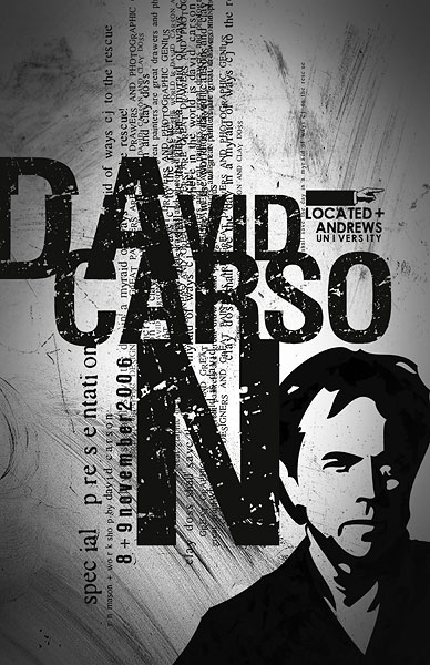
David Carson is an American graphic designer, art director and surfer. He is well known for his innovative magazine typography. The message that he's trying to send through his work is the fact that young people could still read but read in a fun way, which is why his work has different letters that have different sizes and positions, as he wants young people to read again.

Before 1993, David Carson's work was illegible but in 1993 he started his own font label for the Ray Gun Magazine, called GarageFonts, and since then his work has become legible but still kind of hard to read due to it being in different positions and even sometimes one behind the other.

His inspiration is mainly his environment, he taken pictures of what he sees because he believes that what he sees is a great inspiration and causes him to design the things he has designed.


Personally, I think that David Carsons work is really good and that he has a very creative way of projecting it in his magazines.


Sunday, 8 February 2015

EVALUATION

Even though I wasn't able to create my final product, I could finally come to a conclusion of what I wanted to make and how I wanted to make it. However, I was able to make the lower part of the boots which is the slipsole,outsole and toe box all put together to make the lower section of the boot. 

 For this I used wood, Acrylic paint,,PVA glue, sequins, and 0.5cm (long) nails. The materials that I used to create this made the actual piece successful and also suitable for the lower section of a boot. I wanted to create something that gave a certain sense of light which is why I added some sequins to it so that when it is worn the sequins move and create light.


Personally, I think I could have done so much better is a sense, be more creative. What I mean by that is that, could have used different colors for this to make it less common and also I should have made it rest and dry for a day so that It would have looked neat instead of having all those green towel tissues marks on it. 
The materials that I used did make it work, but at the same time I'm thinking that if it was added to a boot and worn for about at least 4 weeks the paint would have worn off and you would be able to see the wood. So, I would say if I had to do this again, I wouldn't use wood or maybe acrylic paint but something that would make the product have a long lasting life cycle.

Overall, I proud and happy of what I have achieved in this 3D area with the theme of light but personally I think I've found it very hard to apply it to what I wanted to create.
Next time, I would have to work quickly and be more decisive and also know what I am doing.

Wednesday, 28 January 2015

Ying Gao


Ying Gao

is a fashion designer and also a proffessor. She gets inspiration of her clothing from
the transformations and social events that are going on around the world.
Most of her designs are inspired by architecture, urban design and multimedia; she combines
them to come up with a unique design.
 http://yinggao.ca/eng/interactifs/nowhere-nowhere/
Check sketchbook 'Ying Gao' page


One of her interactive projects had lights in her designs; of which are the ones that were inspired
by an essay called "Esthétique de la disparition" (The aesthetic of disappearance), by Paul Virilio (1979). "
It is made of photoluminescent thread and imbedded eye tracking technology, is activated by spectators' gaze. A photograph is said to be “spoiled” by blinking eyes – here however, the concept of presence and of disappearance are questioned, as the experience of chiaroscuro (clarity/obscurity) is achieved through an unfixed gaze.

Wednesday, 7 January 2015

PanGenerator (NECLUMI DIGITAL)


DIGITAL LIGHT JEWELLERY 


I found this, the other day, and I thought how creative and amazing it is. In simple words Pangenerator is an app that creats Neclumi jewellery with a projected light; in fact I find it so intriguing on how technology is coming into the art world more than before. This app can be found on the Apple Store, you want to know how it works? Then check out this website and you'll have all the information you need about
it.