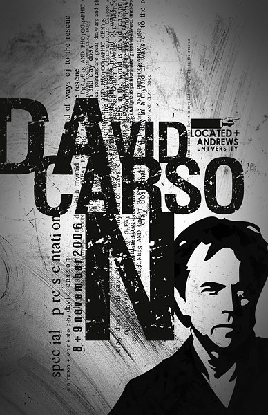
David Carson is an American graphic designer, art director and surfer. He is well known for his innovative magazine typography. The message that he's trying to send through his work is the fact that young people could still read but read in a fun way, which is why his work has different letters that have different sizes and positions, as he wants young people to read again.
Before 1993, David Carson's work was illegible but in 1993 he started his own font label for the Ray Gun Magazine, called GarageFonts, and since then his work has become legible but still kind of hard to read due to it being in different positions and even sometimes one behind the other.
His inspiration is mainly his environment, he taken pictures of what he sees because he believes that what he sees is a great inspiration and causes him to design the things he has designed.
Personally, I think that David Carsons work is really good and that he has a very creative way of projecting it in his magazines.


No comments:
Post a Comment